
Win Fitness:
Brand design
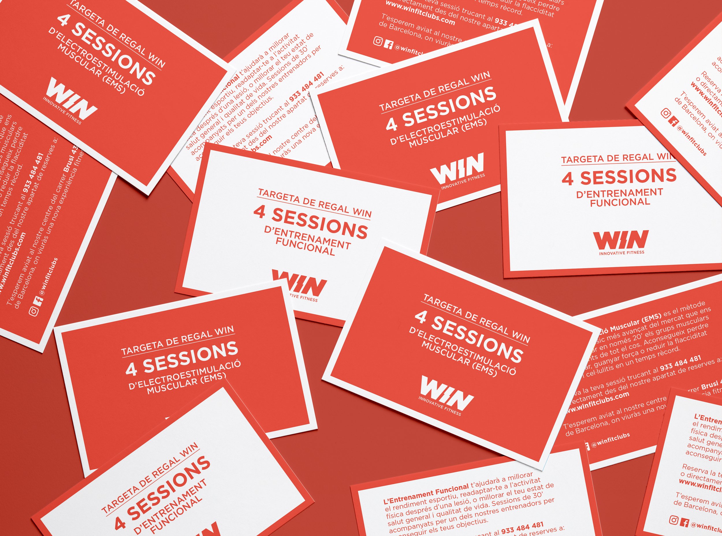
Win is a young boutique finess studio in Barcelona. At the time it was born I was commissioned to define and design the centre’s brand identity.
At the moment the gym started they were pioneers in offering EMS (electrical muscle stimulation) training. This is the reason why the “I” was distorted to look like a lightning bolt. Even though the fitness centre parted ways with EMS training, this characteristic typographic distortion stayed for good and became the brand’s signature.
The success of the centre led to the opportunity to move to a bigger space last year. This brought me another chance to develop a simple, yet effective signage for this brand new home.
Client: Win Fit Clubs
Year: 2016 - 2023